What are the best fonts for an email
An e-mail consists of HTML code intended to be interpreted and displayed by the various messaging boxes such as Gmail, Yahoo Mail, Hotmail, etc. Not all fonts are compatible with these messaging software . So leave creativity for printed documents. Instead, remember to respect standards and bet on simplicity .
Here are some rules to respect so that your email is readable.
Opt for fonts for a standard S
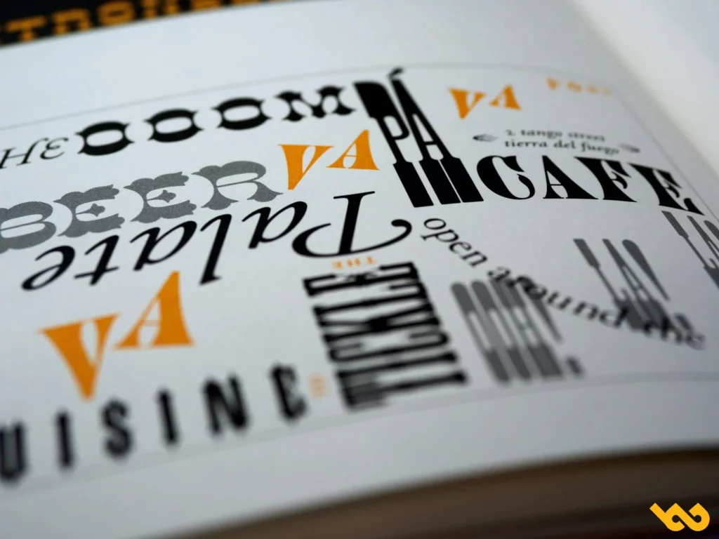
The concept is not the same for the creation of your website and that of your e-mailing campaign. Even if you want your content to stand out, not all of the fanciful fonts are always displayed properly in customer messaging .
In the event that customer's messaging does not support the fonts you have chosen, here are the default fonts used by customer emails in most cases: for iCloud mail Helvetica, for Gmail Arial, for the old version of Microsoft Outlook Calibri and finally for Outlook 2007/2010/2013times New Roman.
To have the guarantee that your message will arrive as you have designed it, use fonts for an email compatible with the different messaging solutions. You can also use the fonts directly offered in the editor's
Here is the list of the 8 best fonts for a secure email that you can use:
- Arial is the most used. It is provided with all Microsoft versions and by all customer emails;
- Helvetica is one of the most used. It is easy to read;
- Times New Roman has a traditional feel. It is used by default in word processing programs;
- Verdana is designed to be readable on all screens;
- Courier / Courier New is similar to Times New Roman;
- Tahoma is used as the default font for Windows 95, 2000, and XP versions;
- Georgia is supported by email clients;
- Trebuchet MS has a sans serif character. It was designed for on-screen reading.
Users spend around ten seconds on their email. This is why your message must be readable very quickly.
However, a good font is not enough to make your email readable, other factors are necessary.
Use the right features
Sans Serif Font
For a ventilated text, choose a typography without wheelbase. Your message will gain clarity. Indeed, they do not have a decorative line at the end of the characters. This fact makes them easier to read on the screens because they are clear. The most popular fonts for an email without serif are arial, Trebuchet MS and Helvetica . However, you can use a serif font for headers . The fonts for the most used serif e-mail are Times New Roman and Georgia.
Great writing
On average 16 points is ideal, titles will be able to differentiate themselves from the body of the text with 26 points . To clearly distinguish your signature from the rest of your email, put there in a smaller size 12 points . However, be careful if you use different characteristics of fonts for an email because the sizes are not the same.
Hierarchy
Respecting the hierarchy makes your email easier to read. Practice the classic layout rules . So don’t hesitate to use titles, subtitles, as well as space between paragraphs and between lines. most commonly used line height 22 and 24 points .
too narrow spaces between the characters influence the readability of your email . Times New Roman and Georgia seem to be in this case. Courier /Courier New Police offers a good distance between their characters.
The spaces between different elements of the email are equally important.
Number of fonts for an email and colors
Two fonts for a different email (three maximums) will be more than enough to highlight the hierarchies in your message.
It is the same for colors. They must be used judiciously. It is imperative that the links stand out in your message. It is advisable to use only color to enhance your brand . As a rule, the blue color is reserved to accentuate the links . However, you can create links in the color of your logo.
Anchor text and button
To make your link stand out from the rest of your post, make anchor text consistent with the content of the link. Do not make links with a single word, it will risk getting lost in your text.
In the same concept, the buttons have a more interactive shape. They are ideal for encouraging people to try your products. Make sure the color of the button stands out from your overall message.
Banner and image
You are free in the design of your email banner and your images. You can choose your typography. The most important thing is that it is readable and highlights your brand. Although you have to be careful that the text is not too long. The message should inspire the user to continue reading the email.
For images, it is recommended to leave space before and after for clarity.
Do not risk using fonts for an unusual email in your email, because the rendering on your reader's messaging is not guaranteed. The typography that will not be supported will be modified. You may send a blurred, even obscured message. Only, make sure that the police you choose to translate the objective of your content and adapt to your activity.
🗣 User experiences of concrete cases on fonts for an email
Julie T., CRM manager in fashion
“We had been using Arial for years. We tested Georgia for a special premium campaign: the feedback was clear. The opening rate has remained stable, but the click rate increased by 17 %, probably due to the best readability on mobile. »»
Marc D., founder of a tech newsletter
"After an A/B test between Helvetica and Verdana, Verdana has largely won: easier to read on Outlook and Apple Mail, especially on small screens. Since then, we swear by her for our shipments. »»
Sophie A., Freelance in writing B2B
"I received direct feedback from my clients telling me that my emails in Times New Roman were" old -fashioned ". I went to Open without, and the answers are faster. The tone seems more current. »»
Jean-Baptiste M., Marketing email agency
“For a luxury customer, we used a personalized font via image. Result: unsubscription rate x2. We understood that accessibility and compatibility take precedence over style. »»
🎓 Experts and data reviews from font studies for an email
LITMUS (Client email report Market Share 2023)
“System fonts like Arial, Helvetica and Georgia provide maximum compatibility on more than 90 % of email customers, which guarantees rendering uniformity. »»
Campaign Monitor
“A comparative study shows that the Sans-Serif fonts like Arial, Tahoma and Verdana improve the perceived readability in B2B emails by 10 %. »»
Ann Handley, author of Everybody Writes
“The objective of an email is not to be pretty but to be read. Choose a font that is not noticed. Elegance comes from visual comfort. »»
Google Fonts / UX Collective
“Fonts like Roboto or Open without providing fluid reading on all digital media. They have become modern standards, even if they are not always supported native on all email customers. »»
Magileads is prospecting automation software that lets you easily manage all the complex aspects of your marketing processes.
Test Magileads for free in 14 days. Click here .
Or book a demo to see how it works. Click here .